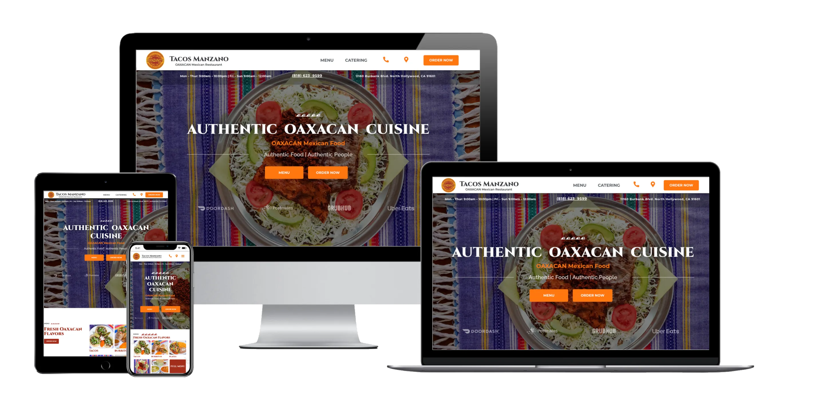
Why Mobile-First Design Is Critical For Local Business
Over 60% of local searches happen on a smartphone. If your site isn't optimized for thumbs, you are bleeding revenue.
The Death of Desktop-First Thinking
For years, designers built beautiful desktop websites and then tried to awkwardly compress them down into mobile views. Today, Google utilizes mobile-first indexing, meaning they rank your site based solely on how the mobile version performs.
Designing for 'Thumbs'
Mobile-first design isn't just about making things fit; it's about usability. Phone numbers must be clickable. Menus must be accessible without pinching and zooming. Critical Call-to-Action buttons should be within easy reach of a user's thumb.
By prioritizing the mobile experience, you significantly reduce bounce rates. When a potential customer lands on your site via a Google Maps search on their phone, a seamless mobile experience instantly builds trust and authority.
Need Help With Custom Web Design?
Learn how Cianic can implement these strategies for your business today.